Skip to content

Responsive Design: A Guide to Creating Websites for All Devices
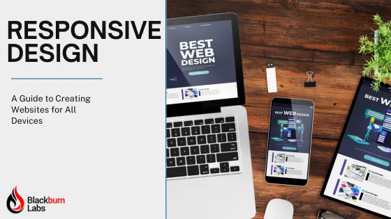
In an era where the digital landscape is rapidly evolving, responsive web design has transitioned from a trend to a fundamental necessity. As of 2022, a staggering 58.99% of global website traffic was generated from mobile devices, excluding tablets. This shift towards mobile browsing underscores the critical need for websites to adapt to various screen sizes and user environments. In this article, we delve into the essence of responsive web design, its increasing relevance in our increasingly mobile-first world, and why it's imperative for businesses and developers to prioritize adaptability in their digital strategy. From understanding the basic principles of responsive design to exploring its impact on user experience and engagement, we aim to provide a comprehensive guide that addresses the need for fluid and flexible web solutions in a world where the line between desktop and mobile usage is continually blurring.”

What is Responsive Web Design?

Responsive web design is building websites that ensure optimal viewing and interaction experiences across any device. The main goal is to create a website that adapts and responds to the user's device, providing an excellent user experience regardless of screen size or orientation.

In simpler terms, a responsive website looks good and functions well whether you're accessing it on a desktop, laptop, tablet, or smartphone. This adaptability is done through flexible grids and layouts, images, and the clever use of cascading style sheets (CSS).

Examples and Applications: Adapting Menus for Different Devices

A common element that undergoes significant transformation in responsive design is the navigation menu. Here’s how it typically adapts across different devices:

Desktop Layouts: On larger screens, like desktops, navigation menus often appear as horizontal bars. They can afford to occupy more space, allowing each menu item to be visible. Dropdown menus are commonly used for sub-categories, offering a hover effect for easy navigation.

Mobile Layouts: On smaller screens, such as smartphones, screen real estate is limited. A popular solution is to use a 'hamburger' menu icon, which is a button with three horizontal lines. Tapping this icon typically reveals a slide-out menu or a dropdown list, conserving space while still providing access to the full range of navigation options.

Tablets and Intermediate Screens: For intermediate-sized devices like tablets, designers often have to make a choice based on the specific context and user behavior. Some might retain the desktop-style horizontal menu if there’s enough space, or switch to a more mobile-friendly menu style if that enhances usability.

CSS Example for a Responsive Menu: A basic example of a CSS media query for a responsive menu might look like this:

In this example, the navigation menu is displayed as a horizontal bar (flex) on larger screens. For screens narrower than 600 pixels, it switches to a block layout, typically indicative of a vertical menu or a hidden menu that is shown when a 'hamburger' icon is clicked.

The Need for Responsive Design

1. Ubiquity of Mobile Devices

The use of mobile devices to browse the internet has skyrocketed in recent years. Business owners and entrepreneurs must recognize this trend and adapt their online presence accordingly. A responsive design ensures that your website looks and functions flawlessly on smartphones and tablets, capturing a vast audience that relies on these devices for information.

2. Improved User Experience

User experience (UX) is paramount to the success of any website. A responsive design ensures visitors can easily navigate and interact with your site, regardless of their device. A positive user experience leads to higher engagement, longer browsing sessions, and increased chances of conversion for small businesses and app developers.

3. Google's Mobile-First Indexing

Search engines play a crucial role in directing traffic to your website. Google, the dominant search engine, has adopted a mobile-first indexing approach. This means that Google predominantly uses the mobile version of the content for indexing and ranking. A responsive design is user-friendly and aligns with Google's preferences, improving your website's search engine rankings.

4. Cost-Effective Solution

In the past, businesses often created separate mobile versions of their websites. However, maintaining two distinct sites can take time and effort. Responsive design streamlines this process by offering a single website that caters to all devices. This design saves money on development and maintenance and ensures consistency in content and branding across platforms.

5. Accessibility for All

Inclusivity is a fundamental aspect of the digital landscape. A responsively designed website ensures that your content is accessible to everyone, regardless of your clients' devices or abilities. This accessibility is a legal requirement in many regions and reflects your commitment to providing an inclusive online experience.

6. Future-Proofing Your Website

Technology is ever-evolving, and new devices with different screen sizes and capabilities are regularly introduced. Responsive design future-proofs your website by ensuring it can adapt to these changes without needing a complete overhaul. This flexibility is crucial for businesses and app developers looking to stay ahead of their competitors.

How to Achieve Responsive Design

Now that we understand the importance of responsive design, let's explore some fundamental principles and practices to achieve it effectively:

Step 1: Get Fluid Grids and Flexible Layouts

The foundation of responsive design lies in using fluid grids and flexible layouts. Designers use percentages instead of fixed pixel values to define widths and heights. This allows the layout to adapt seamlessly to different screen sizes, ensuring a consistent device experience.

Step 2: Use Media Queries

Media queries are CSS rules that apply different styles based on the device's characteristics, such as screen size, resolution, and orientation. By utilizing media queries, developers can create stylesheets tailored to specific devices, enhancing the overall responsiveness of the website.

Step 3: Implement Flexible Images

Images are a crucial component of web design, and ensuring they scale appropriately is vital for responsiveness. It can hinder the user experience when a picture crops or is not properly sized. Using CSS properties like max-width: 100% ensures that images resize proportionally to the screen size, preventing them from breaking the layout on smaller devices.

Step 4: Guarantee a Mobile-First Approach

Adopting a mobile-first approach means designing the website for mobile devices initially and then progressively enhancing it for larger screens. This ensures a solid and fast foundation for smaller screens and a streamlined experience that can gradually improve for larger screens.

Step 5: Test Across All Devices

Responsive design is not a one-size-fits-all solution. It requires thorough testing across various devices and browsers to identify and address issues. Emulators and accurate device testing help ensure your website performs optimally on any of the devices your audience may use.

Elevate Your Online Presence with Blackburn Labs

Responsive web design is no longer a luxury; it's a necessity in today's market. Business owners must prioritize creating websites that offer seamless experiences across all devices to stay competitive and reach a broader audience to reach their business goals.

If you want to elevate your online presence and create a website that genuinely resonates with your audience, consider partnering with Blackburn Labs. Our team of experts specializes in responsive design, ensuring that your website meets the highest standards and aligns with the latest industry trends.

Ready to take the next step? Contact Blackburn Labs today and let us transform your online presence.

Remember, in the digital age, responsiveness is not just a feature – it's a requirement for success. Embrace it, and watch your online presence thrive across all devices.

Scroll to Top