Flutter Animations: Part 2
In Part 1, we discussed Flutter Implicit animations. Implicit animations are simple wrappers around widgets that allow easy animations without extensive coding. The core concept is that you provide a duration and an end value, and Flutter handles the transition between starting and ending values.
Before diving deeper, let’s remember that animation can be understood as a sequence of images displayed over time. All implicit animation widgets derive from ImplicitlyAnimatedWidget, which provides a simple way to animate widget properties.
AnimatedDefaultTextStyle
The AnimatedDefaultTextStyle widget allows transitioning text styles over time. It can animate properties like:
- Color
- Font size
- Font weight
- Letter spacing
- Word spacing
- Height
- Font family
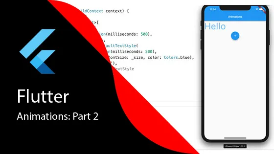
Here’s an example where a “Hello” text widget changes size and color when a Floating Action button is clicked, with the animation occurring over 500 milliseconds:
class _MyHomePageState extends State<MyHomePage> {
  double _size = 16.0;
  Color _color = Colors.blue;

  void _changeStyle() {
    setState(() {
      _size += 10.0;
      _color = _color == Colors.blue ? Colors.green : Colors.blue;
    });
  }

  @override
  Widget build(BuildContext context) {
    return Scaffold(
      body: Center(
        child: AnimatedDefaultTextStyle(
          duration: Duration(milliseconds: 500),
          style: TextStyle(
            fontSize: _size,
            color: _color,
          ),
          child: Text('Hello'),
        ),
      ),
      floatingActionButton: FloatingActionButton(
        onPressed: _changeStyle,
        child: Icon(Icons.add),
      ),
    );
  }
}
AnimatedOpacity
AnimatedOpacity allows animating the opacity of a widget over a specified duration. This is useful for creating fade-in and fade-out effects.
Here’s a simple example demonstrating a container widget’s opacity being animated over 1500 milliseconds:
AnimatedOpacity(
  opacity: _opacity,
  duration: Duration(milliseconds: 1500),
  child: Container(
    width: 200,
    height: 200,
    color: Colors.red,
  ),
)
Understanding Implicit Animation Properties
Implicit animations typically have three key properties:
- Duration: How long the animation takes to complete
- Curve: An optional easing curve to adjust the animation rate (makes animations feel more natural)
- Animated Property: The specific property being animated (varies by widget type)
Combining Animations
Multiple implicit animations can be combined to create more complex effects. Here’s an example that wraps AnimatedDefaultTextStyle within AnimatedOpacity, each with its own duration:
AnimatedOpacity(
  opacity: _opacity,
  duration: Duration(milliseconds: 1000),
  child: AnimatedDefaultTextStyle(
    duration: Duration(milliseconds: 500),
    style: TextStyle(
      fontSize: _size,
      color: _color,
    ),
    child: Text('Hello'),
  ),
)
When setState is called and values change, both animations are triggered simultaneously. The text style animation completes in 500ms while the opacity animation takes 1000ms.
Other Implicit Animation Widgets
Implicit animations are simple yet powerful. Flutter provides many other implicit animation widgets worth exploring:
- AnimatedAlign: Animates the alignment of a child widget
- AnimatedContainer: Animates changes to container properties (size, color, padding, etc.)
- AnimatedPadding: Animates padding changes
- AnimatedTheme: Animates theme changes across your app
Each of these widgets follows the same pattern: provide a duration, change a value via setState, and Flutter handles the animation automatically.
What’s Next?
In Part 3, we’ll move beyond implicit animations and explore transition animations, which give you even more control over how your UI animates between states.