Learn How to Dynamically Fit a Site or App on iPhone, iPad, or Any Small Device
From iPhones to huge monitors, regardless of portrait or landscape orientations, the Craft Profit Calculator HTML5 app now accommodates all screen sizes and shapes. Today I will share with you, my small group and quasi-loyal readers, exactly how I did it. It is actually very easy, trust me.
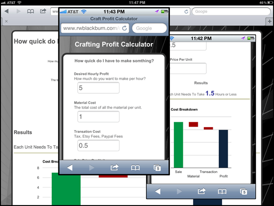
As I recently posted, I have released a new version of my Craft Profit Calculator, a small playground app I use to experiment with and illustrate new concepts. Earlier I posted about the new waterfall charts that were added. Today, I’d like to call out another new feature. From the very first version of the app it was HTML5, and as such was quite flexible. It supported all major browsers as well as all major tablets. However, it didn't size very well to small screens like iPhones or other smart phones, and this bothered me. A lot. Most of the content just didn’t quite fit, and it just didn’t have that cool “application” feel I was shooting for.
So in this latest version I set out to fix that. Now when you view the tool on different devices, it tailors itself to the screen real estate available. I am hardly the first to do this; but I was surprised by just how easy it was to accomplish. Let me note, there are other ways of accomplishing this, but this is the method I prefer and have used on a few apps now. It is scalable, clean, and only uses CSS, no JavaScript or server side technologies.
Application tailors itself to tablets and smart phones in either portrait or landscape modes.
The magic lines in the HTML are these:
The first line (media=all) is the main CSS file. In here, I place the CSS per a standard PC web browser scenario. Feel free to open each of the CSS files to see what they contain; they are intentionally simplified for this reason.
The next two lines are where I apply special styles to mobile devices. Notice that I am not doing device detection, I am using the screen width alone. This is key. What I like about this approach is it works for any scenario where the screen real estate is limited, not just mobile devices. If I decided to place the app in a pop-up window which was less then 800px wide then the “mid.css” styles would kick in. No extra work, which is always a win in my book. Or, if the user reduced the size of their browser window the site would see this and size itself down. In fact, in Chrome or Firefox you can resize the window and what the different style mode take effect (no screen refresh required). Give it a try, it's kind of fun to watch.
The other advantage to this method is it addresses the landscape/portrait scenarios too. Here are the CSS files that will be applied in different scenarios:
- main.css: iPad on landscape mode, or PCs w/Browser window maximized
- main.css & mid.css: iPad in portrait mode, iPhones in landscape mode, or PCs w/Browser windows reduces to 800px wide or less
- main.css, mid.css, & min.css: iPhone in portrait mode, or PCs w/Browser windows reduces to 400px wide or less
As you can see above, that that the CSS files stack. The mid.css and min.css are only a few lines, and they are only the differences between these modes. When windows is less then 800px the mian.css will still load, but then the mid.css will load and override anything from the main.css. Therefore, I only need to place the differences in mid.css and the rest is inherited from the main.css. Take a look, open mid.css and you will see that it's only a small subset of the styles where I reduce the font sizes and shift the layout a bit. The same applies when the screen width drops below 400px; the main.css laods first, then mid.css loads, and last the min.css loads, each overriding the previous and only containing the differences required for that mode.
Therefore, the mid.css and min.css files are quite small, keeping the maintenance light and easy.
There you have it. Only two extra CSS files, each with only a few styles listed and we have an application or web site that will tailor itself to tablets and smart phones in either portrait or landscape modes.