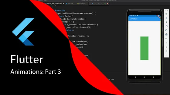
Flutter Animations: Part 3 Transitions
A few past posts talked about Google’s new cross-platform mobile development framework called Flutter (click here for Part 1 of the series). Additionally, Part 2 gave a few more examples of Implicit animations. In this post, we’ll want to cover transitions. Moving from explicit animations to transitions animations, the complexity increases.
What You Need for Transition Animations
To handle transition animations, we need a few more items from the Flutter framework:
- SingleTickerProviderStateMixin: Helps make sure that the animation runs only when the widget is visible.
- AnimationController: Plays the animation
- Animation: Holds the value for the animation
Available Transition Widgets
Here are the Widgets that you can use for transition animations:
- SlideTransition
- ScaleTransition
- RotationTransition
- SizeTransition
- FadeTransition
- RelativeRectTransition
- RelatedPositionedTransition
- DecoratedBoxTransition
- AlignTransition
- DefaultTextStyleTransition
All of these widgets derive from the AnimatedWidget. If you can’t find a transition you need, you can build your own animated widget by subclassing AnimatedWidget yourself. But in another article, we’ll discuss an easier way to create custom animations with AnimatedBuilder.
Focusing on SlideTransition
The setup for these transition widgets is mostly the same. To keep the size of this blog down, we’ll focus on the SlideTransition.
The SlideTransition widget animates the position of its child widget relative to its normal position. If your widget, by default, is positioned at x:10, y:30 and your offset is configured for a dx of 0.75, the animation will move the widget ¾ of the width of its child to the right. You can slide a widget up and down or left and right by setting the Offset to a positive or negative value.
Implementation Steps
Step 1: Add TickerProviderStateMixin
The first step is to add the TickerProviderStateMixin to your State widget. Next, you add variables for the AnimationController and the Animation.
class _TransitionPageState extends State<TransitionPage>
    with SingleTickerProviderStateMixin {
  AnimationController _controller;
  Animation<Offset> _offsetAnimation;

  // ... rest of implementation
}
Step 2: Setup Animation in initState
To setup the animation, we need to create an instance of the AnimationController and the Animation object in the initState method of our state widget.
@override
void initState() {
  super.initState();

  _controller = AnimationController(
    duration: const Duration(seconds: 2),
    vsync: this,
  );

  _offsetAnimation = Tween<Offset>(
    begin: Offset.zero,
    end: const Offset(1.5, 0.0),
  ).animate(CurvedAnimation(
    parent: _controller,
    curve: Curves.elasticIn,
  ));
}
You’ll notice that the duration is now set on the controller instead of the widget, as we did with explicit animations.
Step 3: Dispose the Controller
Don’t forget to dispose the controller when the widget is removed from the widget tree:
@override
void dispose() {
  _controller.dispose();
  super.dispose();
}
Step 4: Create the SlideTransition Widget
Now you can use the SlideTransition widget in your build method:
@override
Widget build(BuildContext context) {
  return Scaffold(
    appBar: AppBar(
      title: Text('Slide Transition Example'),
    ),
    body: Center(
      child: SlideTransition(
        position: _offsetAnimation,
        child: GestureDetector(
          onTap: () {
            if (_controller.status == AnimationStatus.completed) {
              _controller.reverse();
            } else {
              _controller.forward();
            }
          },
          child: Container(
            width: 200,
            height: 200,
            color: Colors.green,
          ),
        ),
      ),
    ),
  );
}
How It Works
The SlideTransition widget is centered in the screen with the Center widget. When the user taps on the green rectangle, the widget will move forward to the right the width of the widget. When they click it again, it will return to center.
The animation uses:
- An AnimationController to control the animation timing
- A Tween to define the start and end positions
- A CurvedAnimation to apply an elastic easing curve
- A SlideTransition widget to perform the actual animation
Conclusion
Although transition widgets take a little more work to setup compared to implicit animations, they allow you a number of options to provide animation to your widget. The key advantages are:
- More control over animation timing and behavior
- Access to animation status and callbacks
- Ability to compose complex animations
- Reusable animation controllers
Stay tuned for Part 4 where we’ll explore more complex animation scenarios!